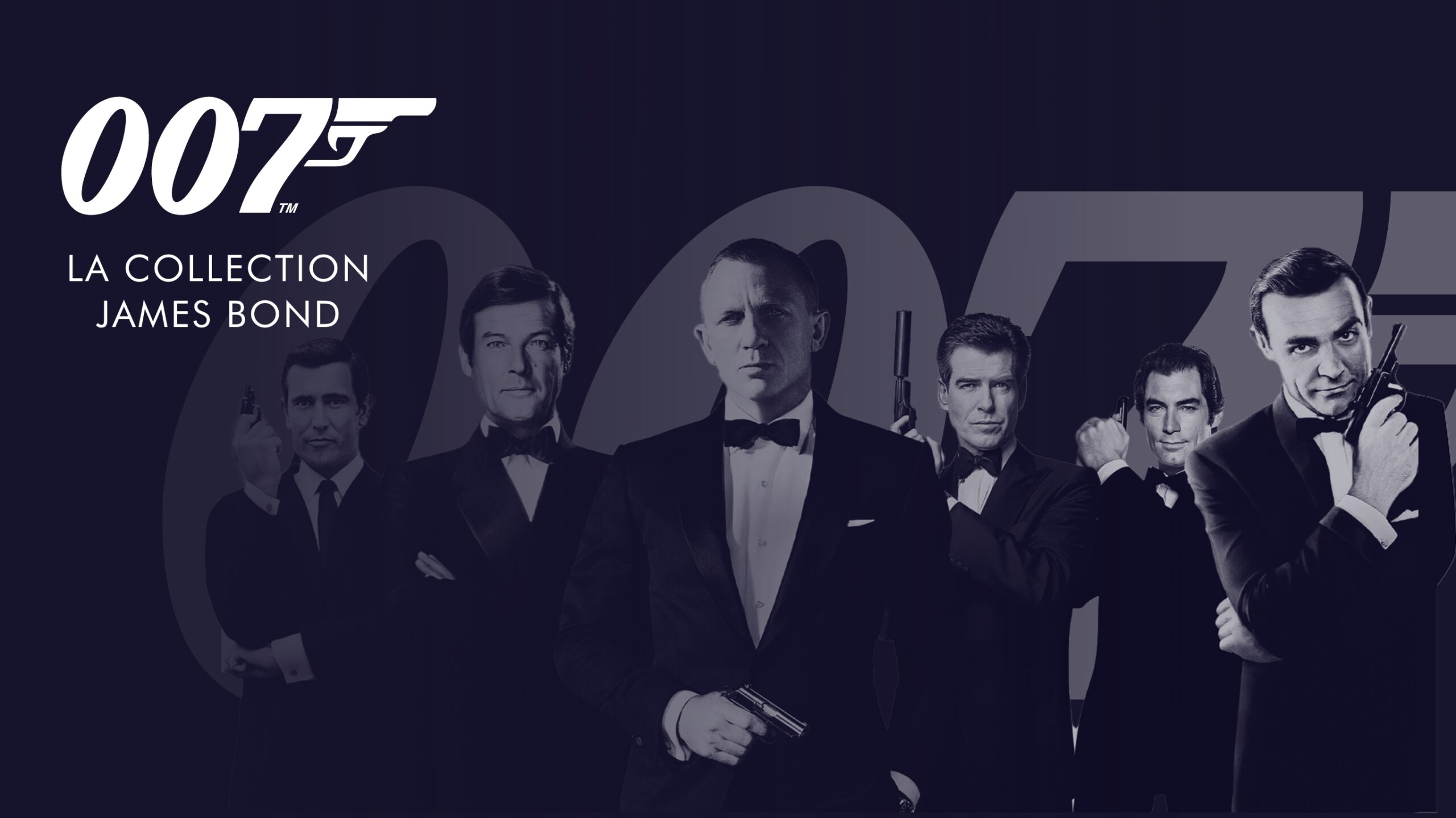
Salto is entering the streaming market. This sector is currently dominated by the American behemoths Netflix, Amazon Prime Video, Disney+ and Apple TV+. However, new services offered by TF1, M6 and France Télévisions suggest there is still room for more growth.
THE CHALLENGE
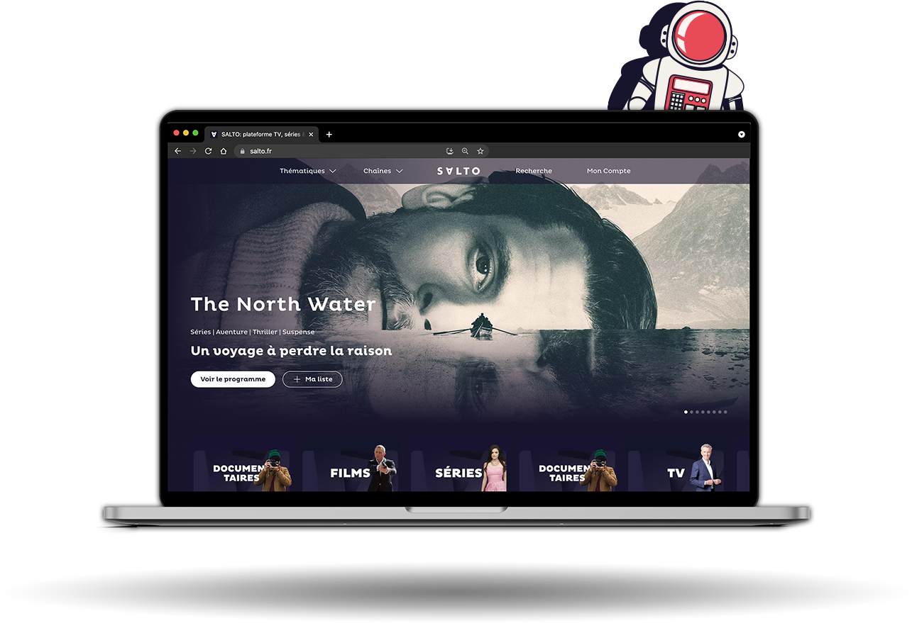
Salto got in touch in September 2020. They weren’t happy with the direction their platform had taken and had just three months to redesign before launch.
AREAS OF FOCUS
ART DIRECTION
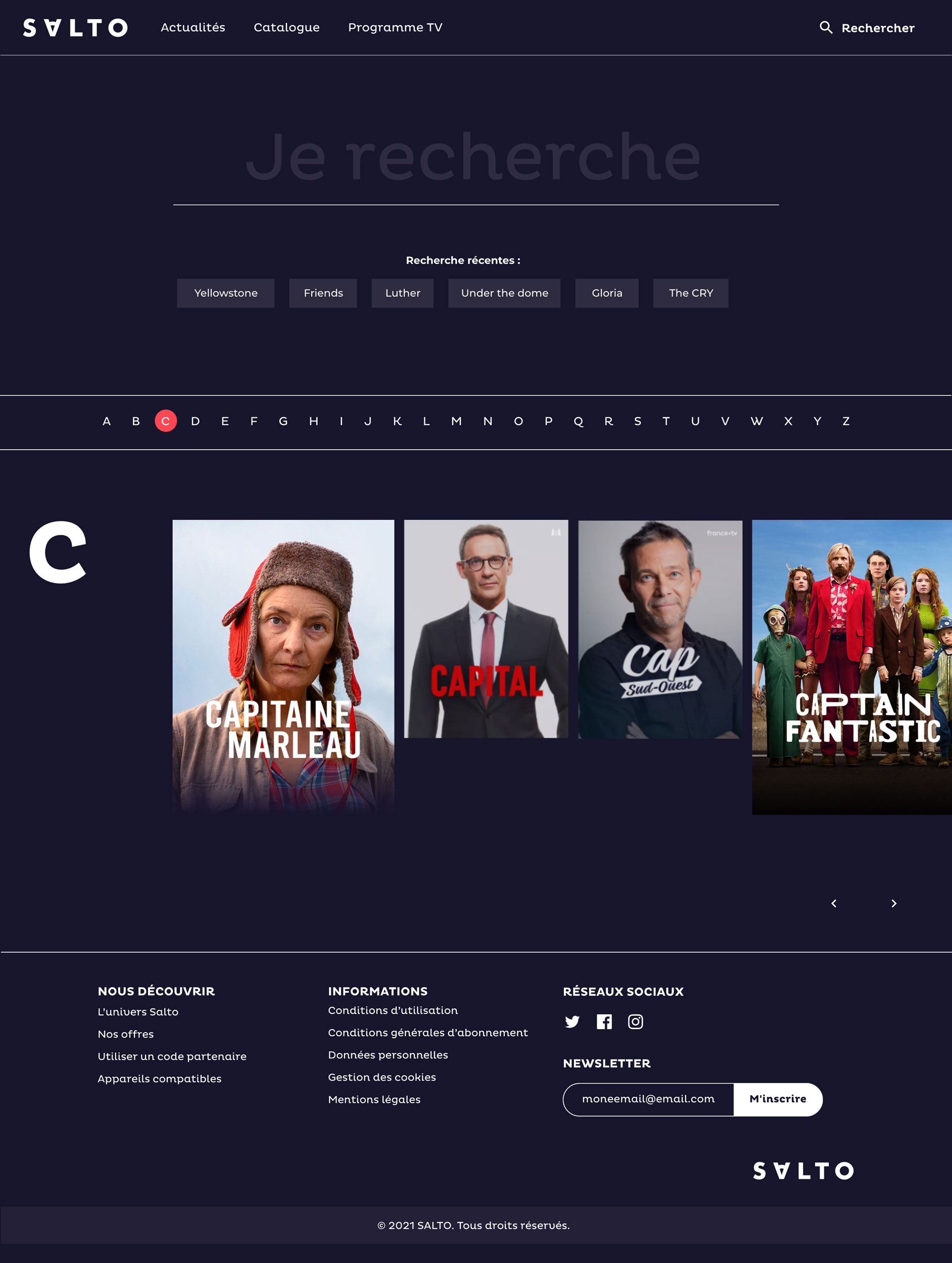
ENGAGEMENT PLATEFORM
CAMPAIGN MAIL
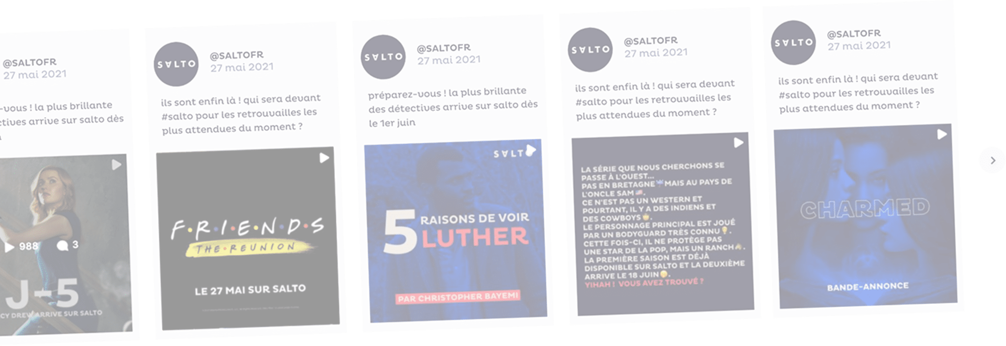
SOCIAL MEDIA
GOODIES
DESIGN
SOLUTION
Create strong visual categories while affirming Salto’s identity.
MODERN AND EFFECTIVE
The streaming world is very competitive. How can a company differentiate itself while retaining its identity and simultaneously broadcasting its library’s strength?
THInking outside the box
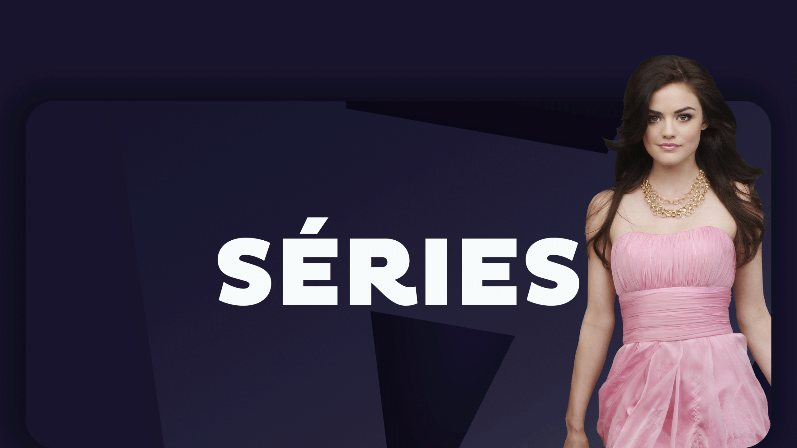
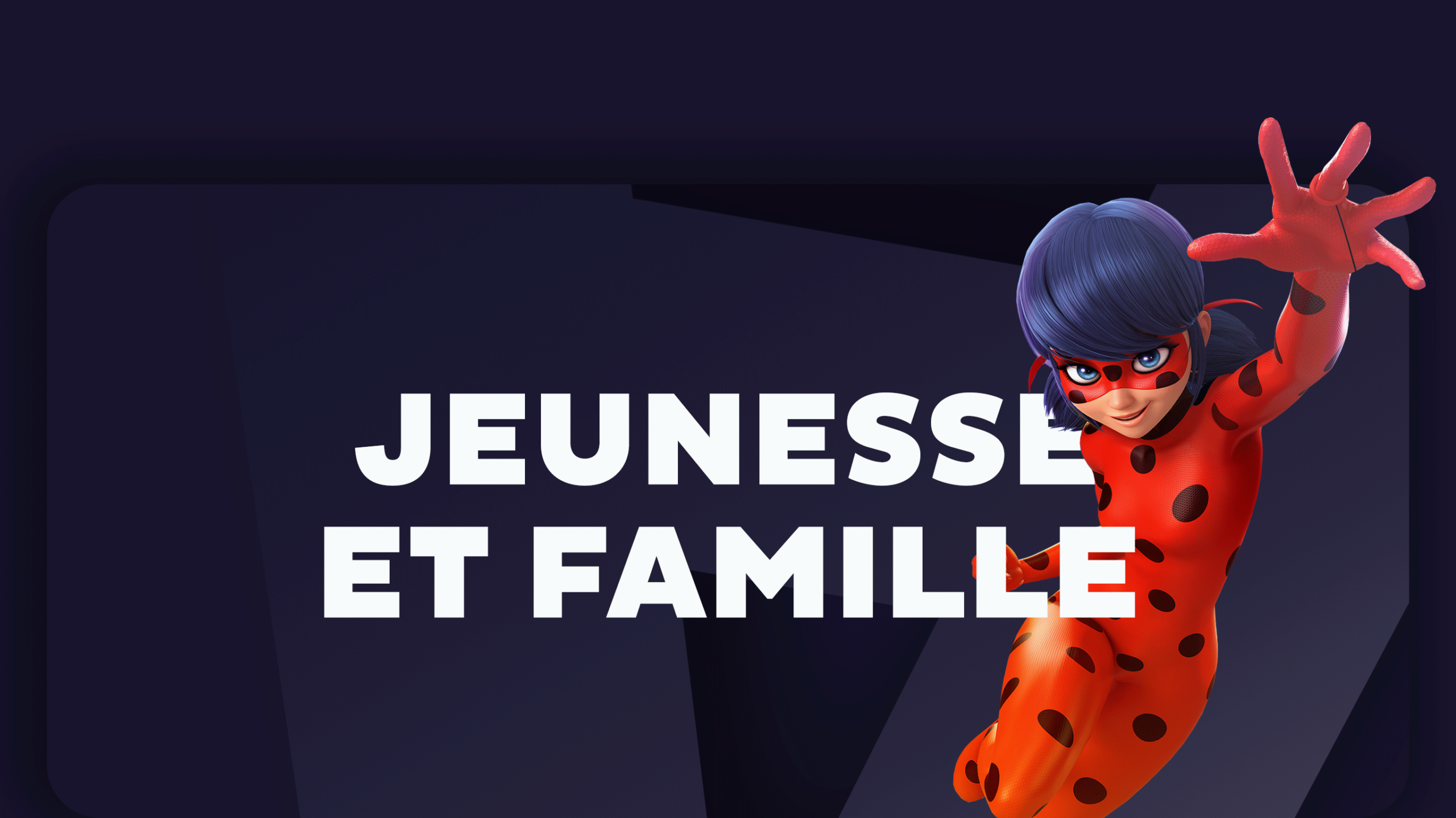
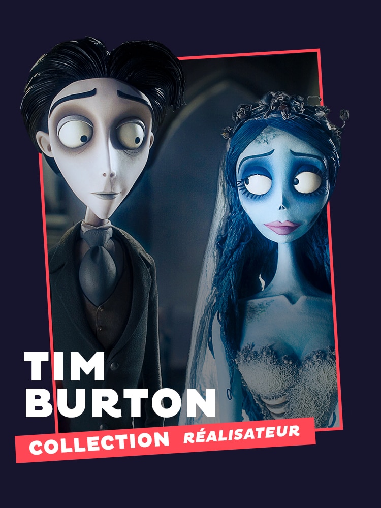
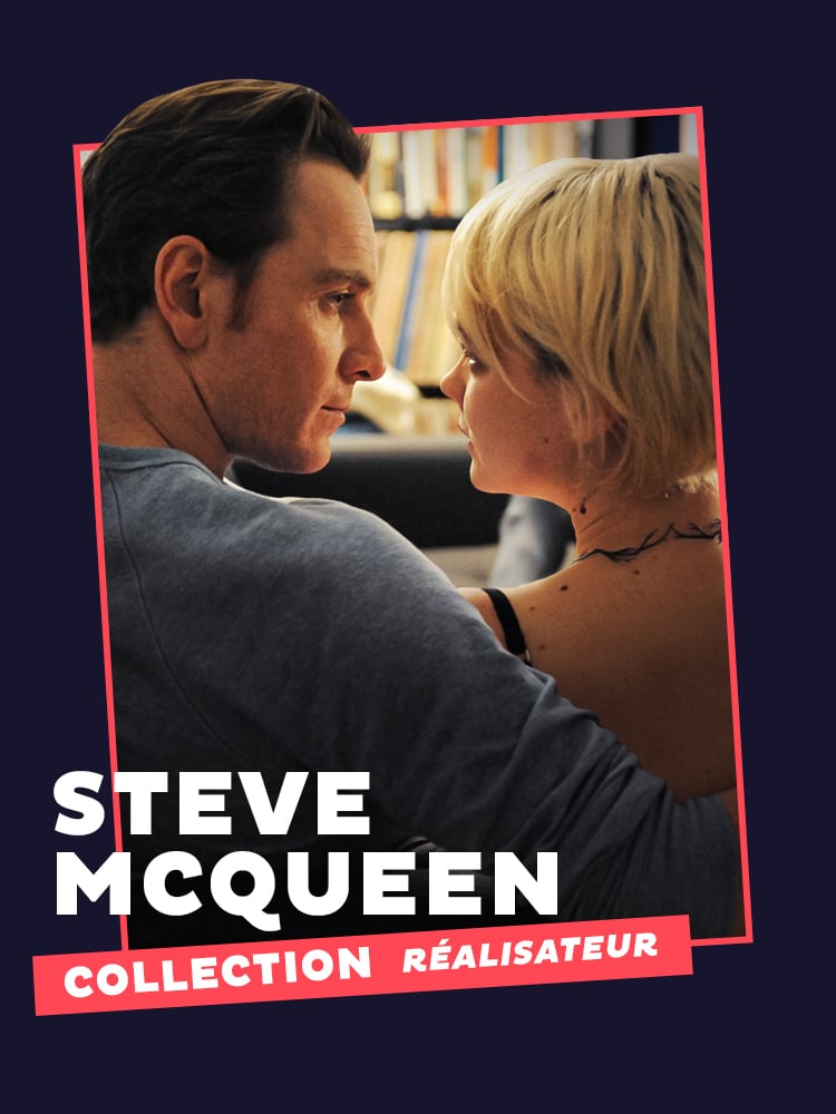
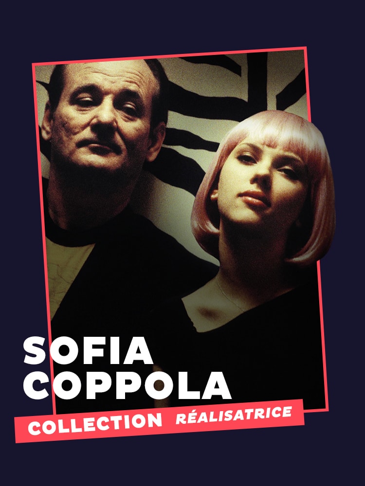
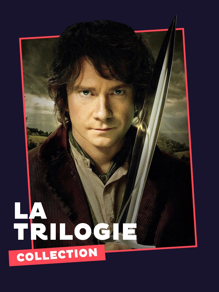
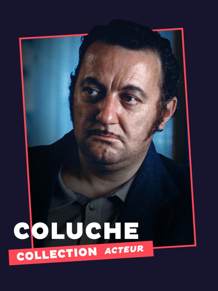
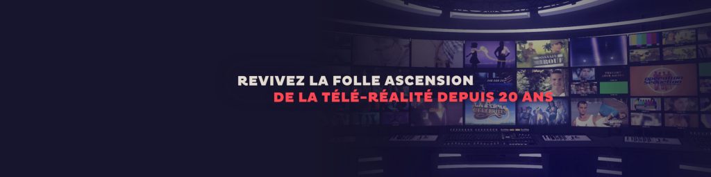
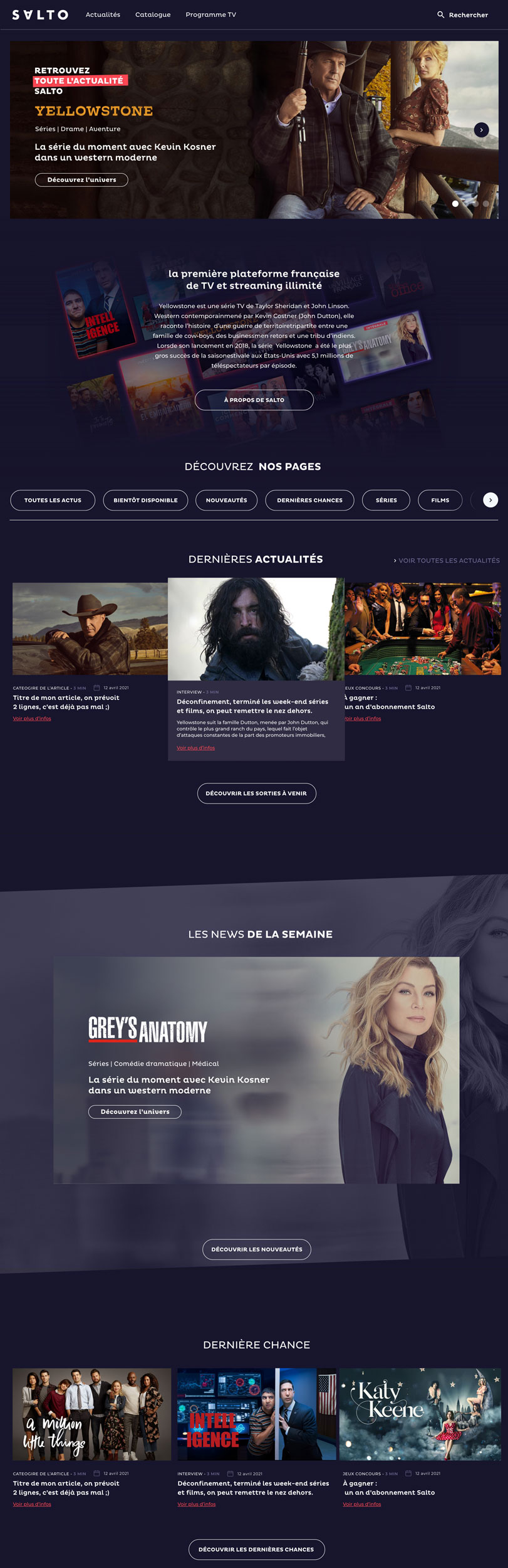
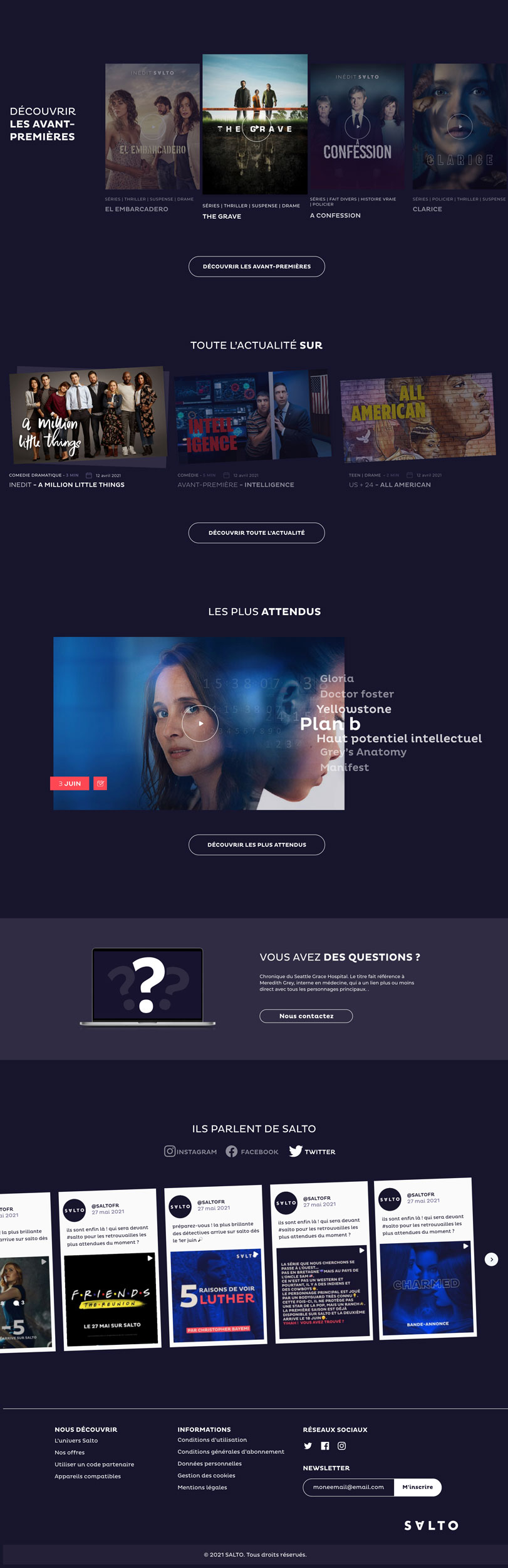
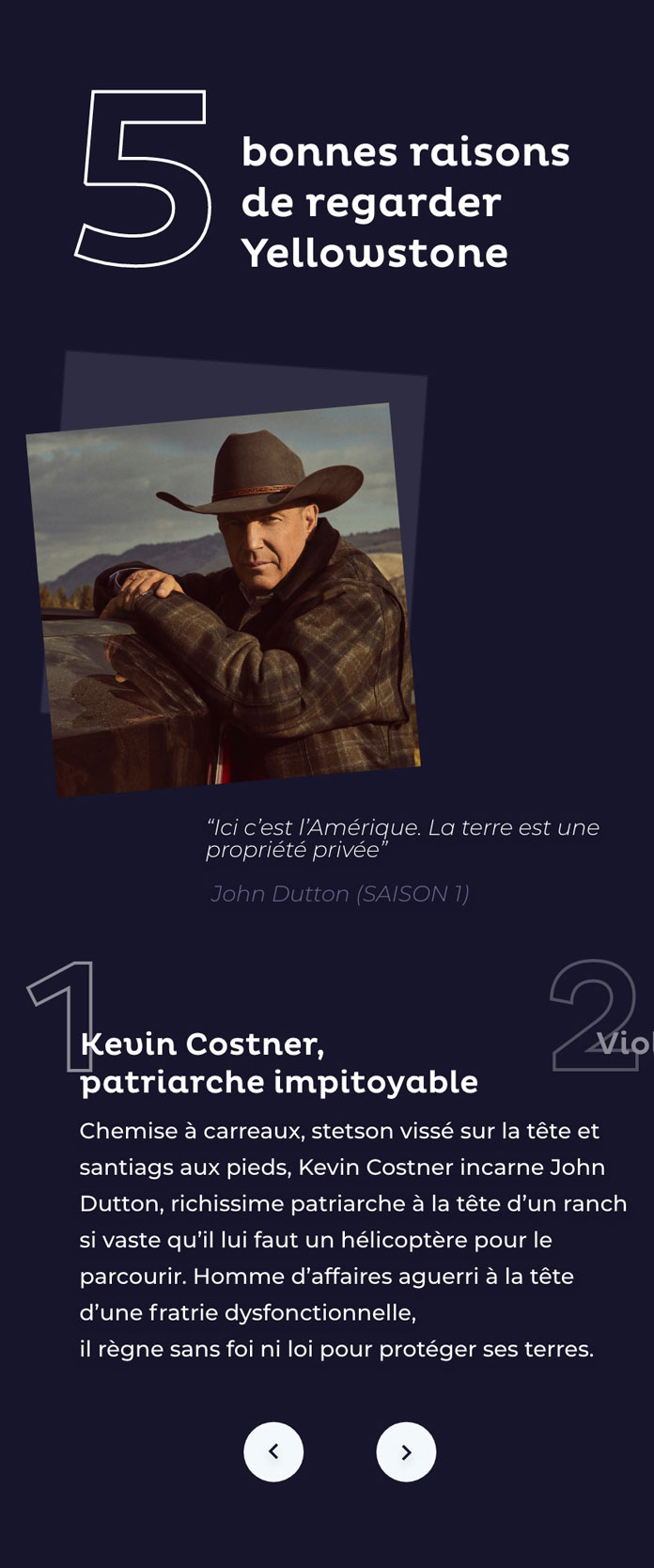
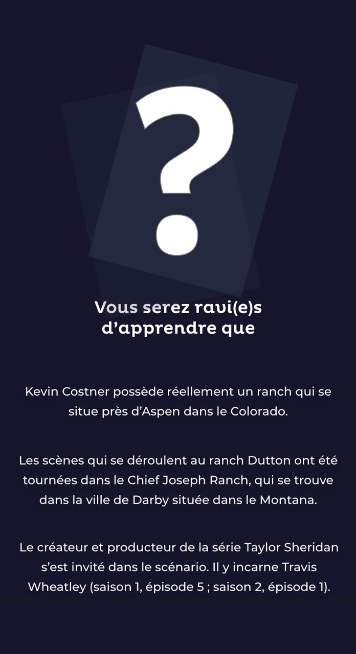
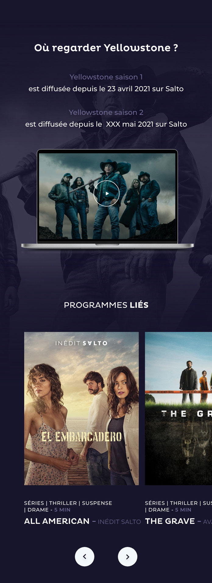
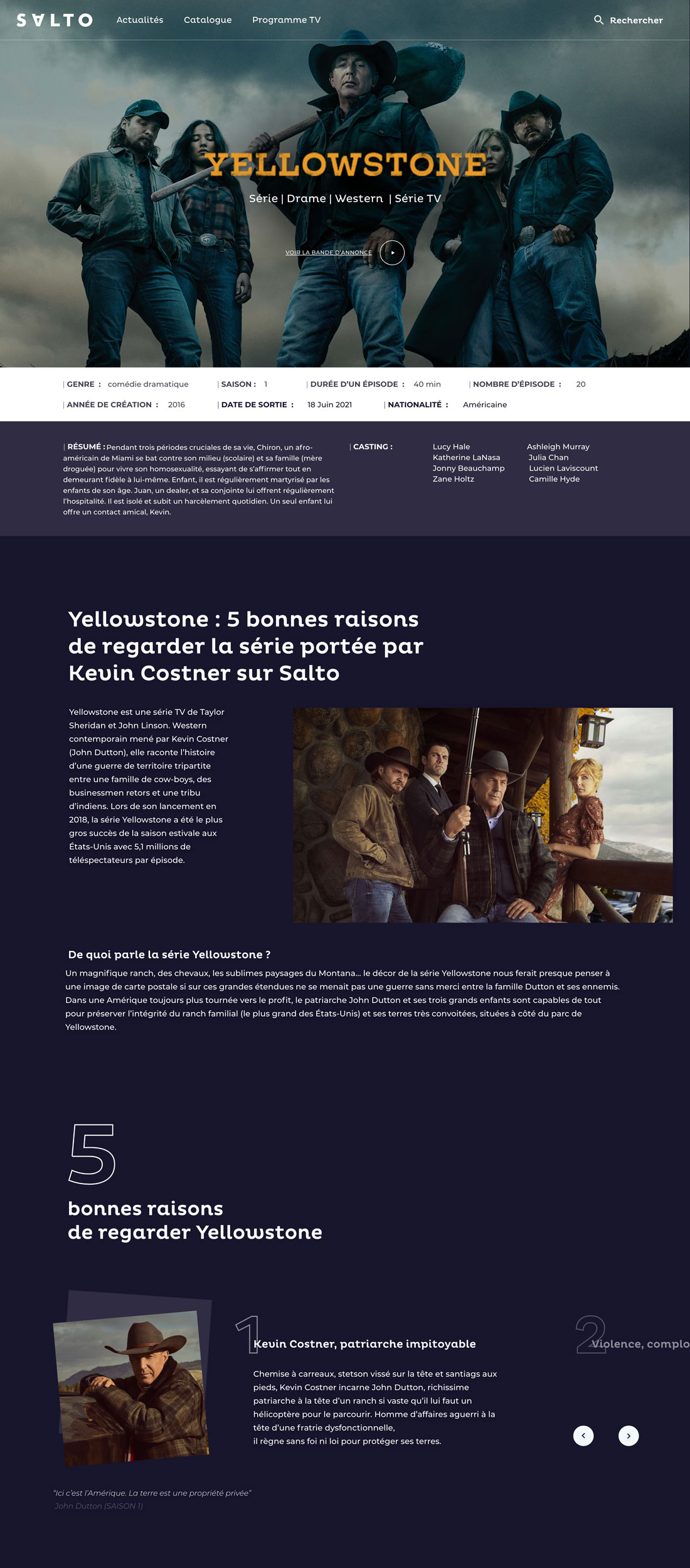
Salto is putting a lot of faith in its content strategy. Its ‘collections’ section was one of our favourites to design because it allowed us to showcase Salto’s material advantage in the French market.
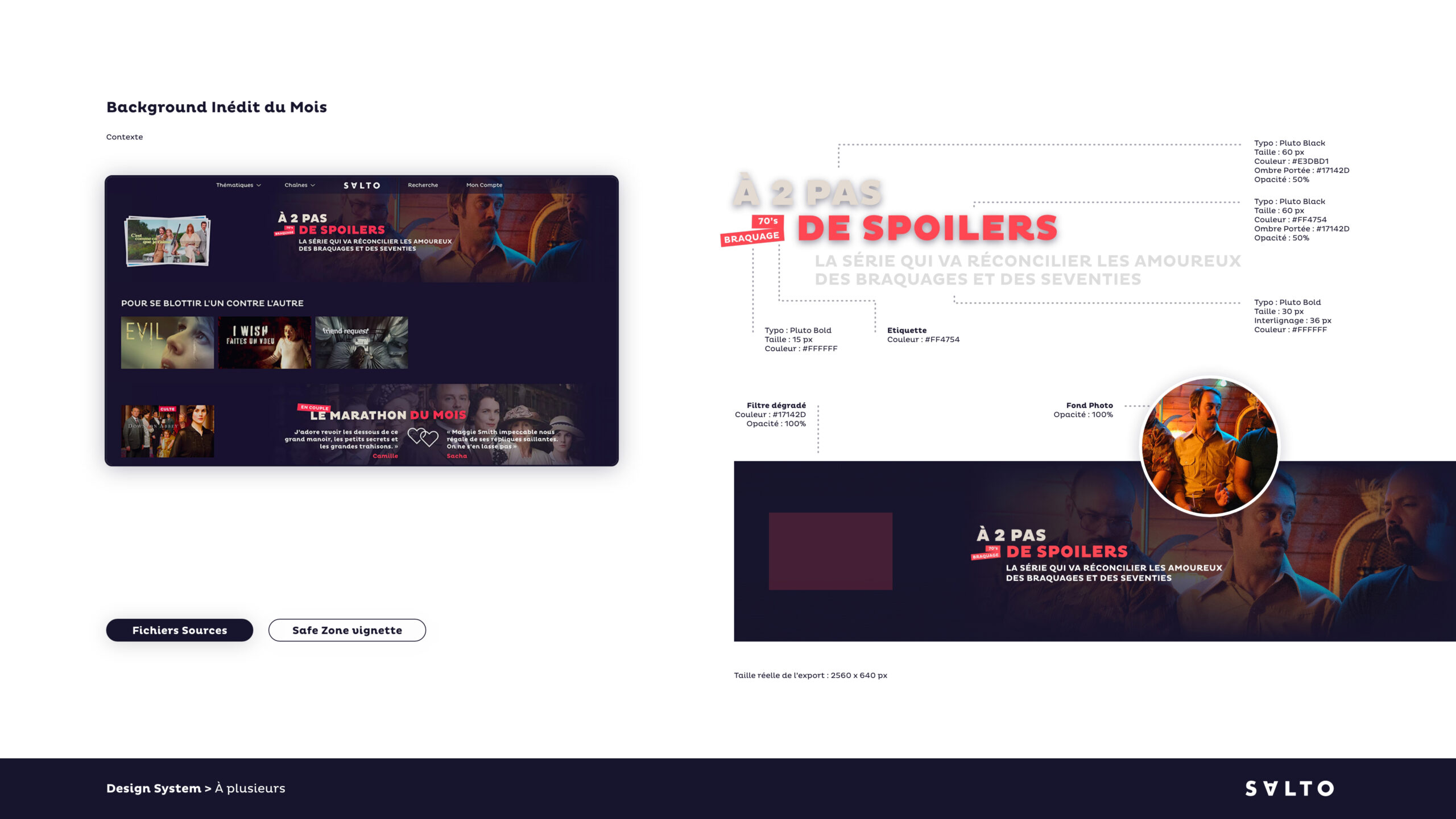
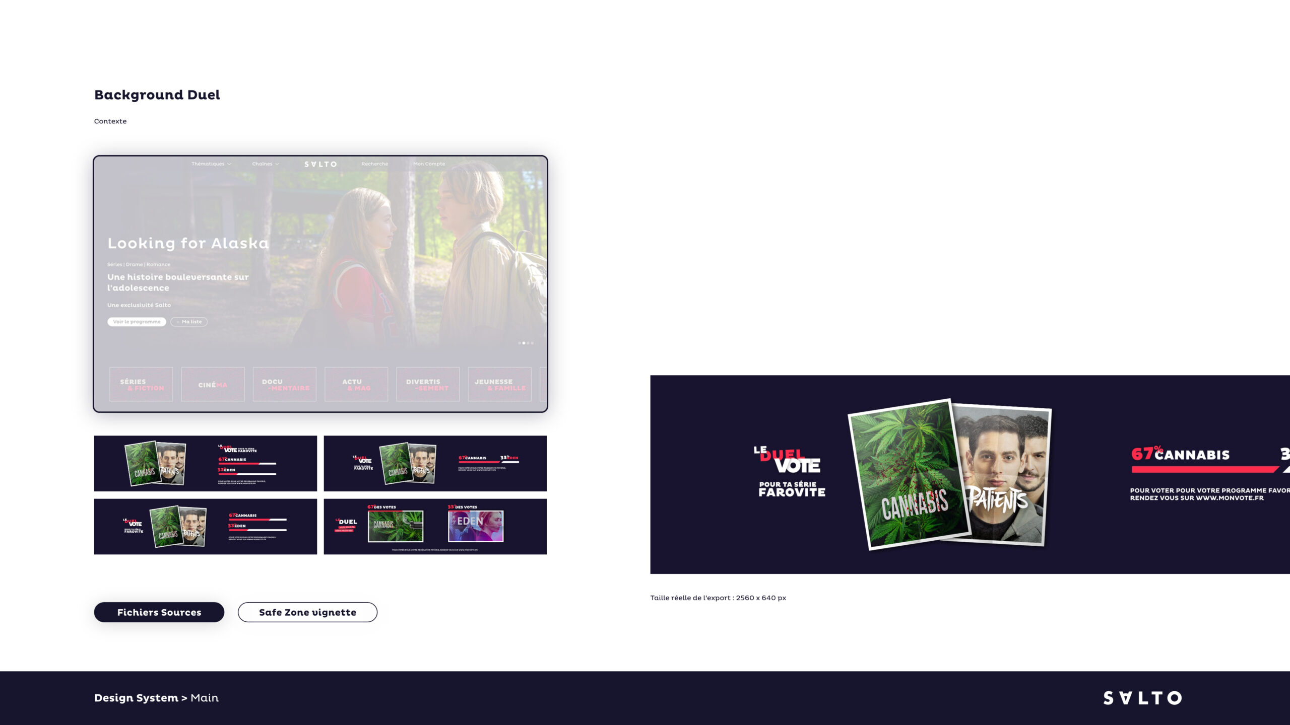
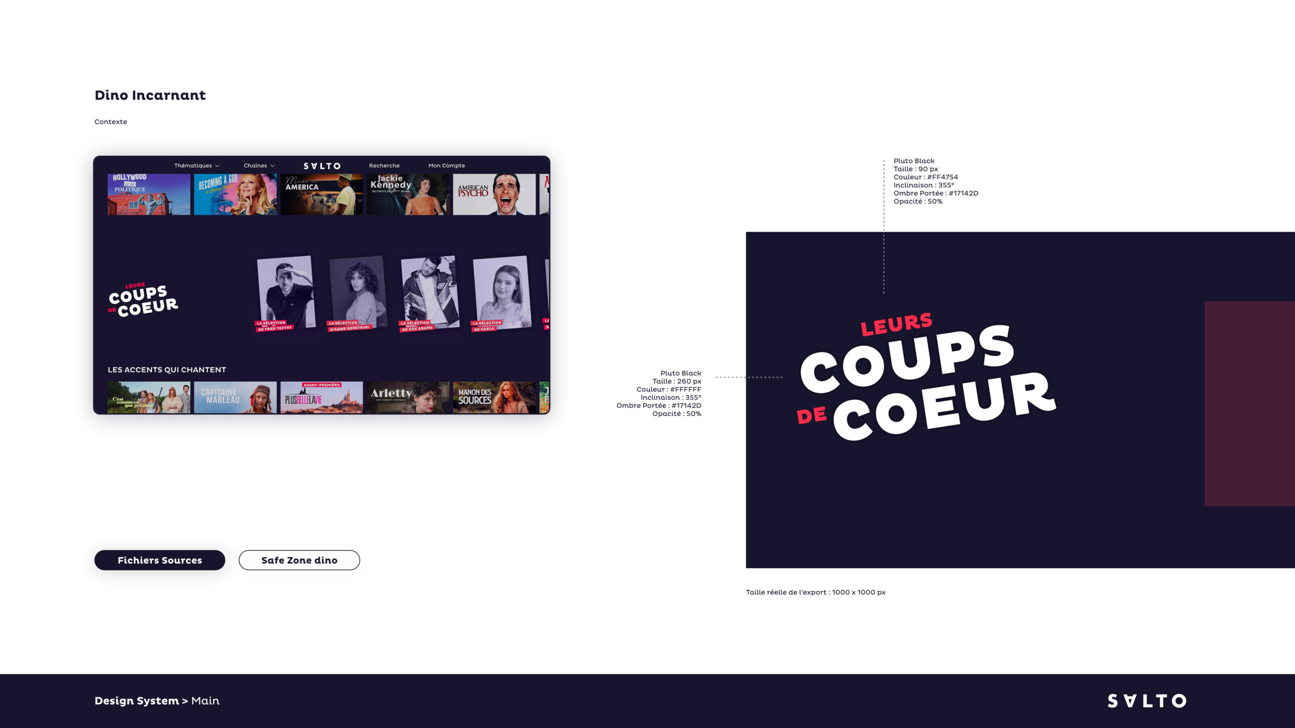
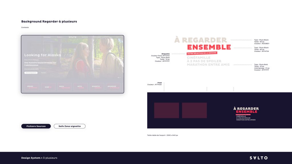
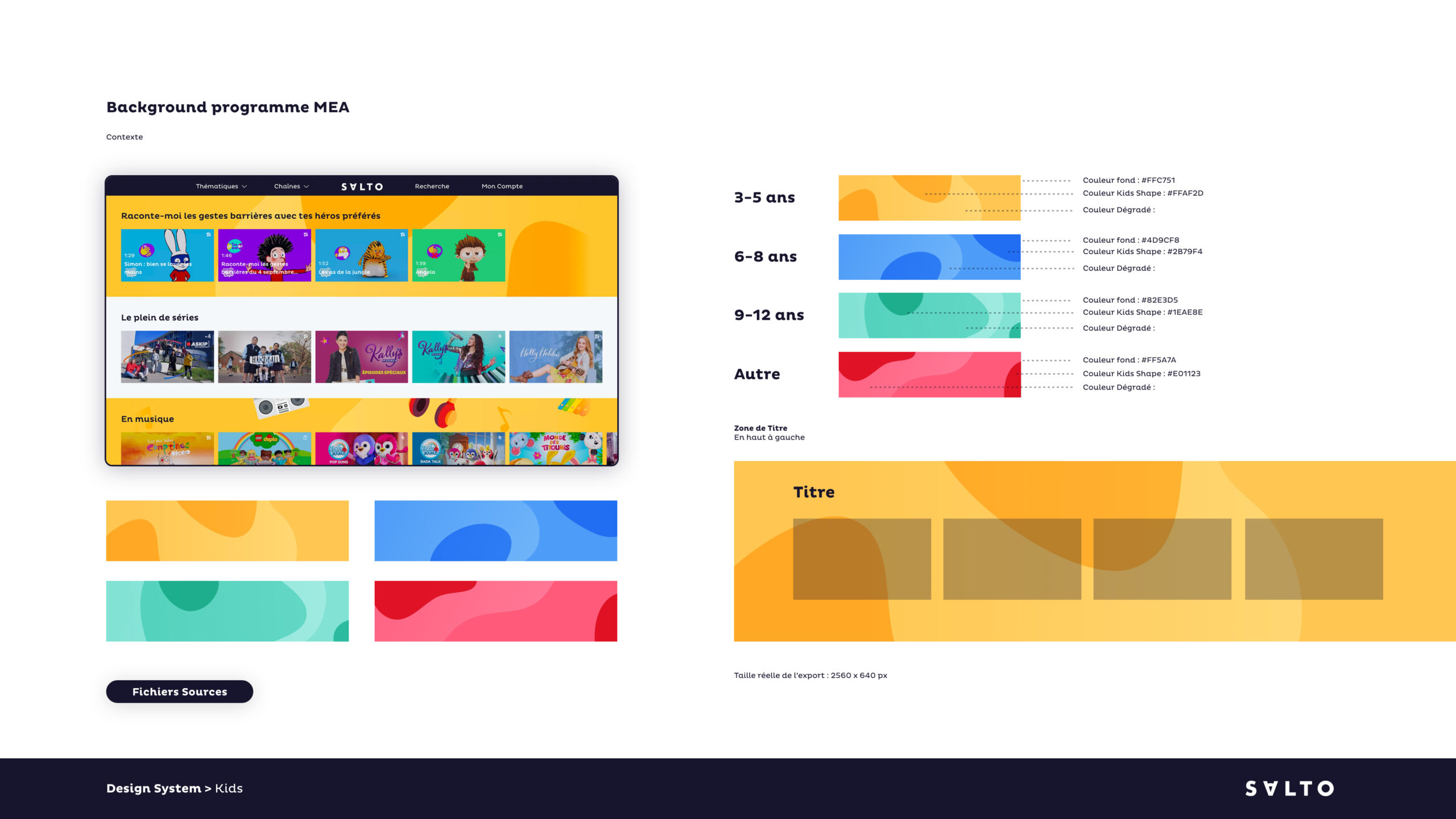
Design background to highlight the content variety.
The platform features a special banner that represents the mood and genre of programming available.
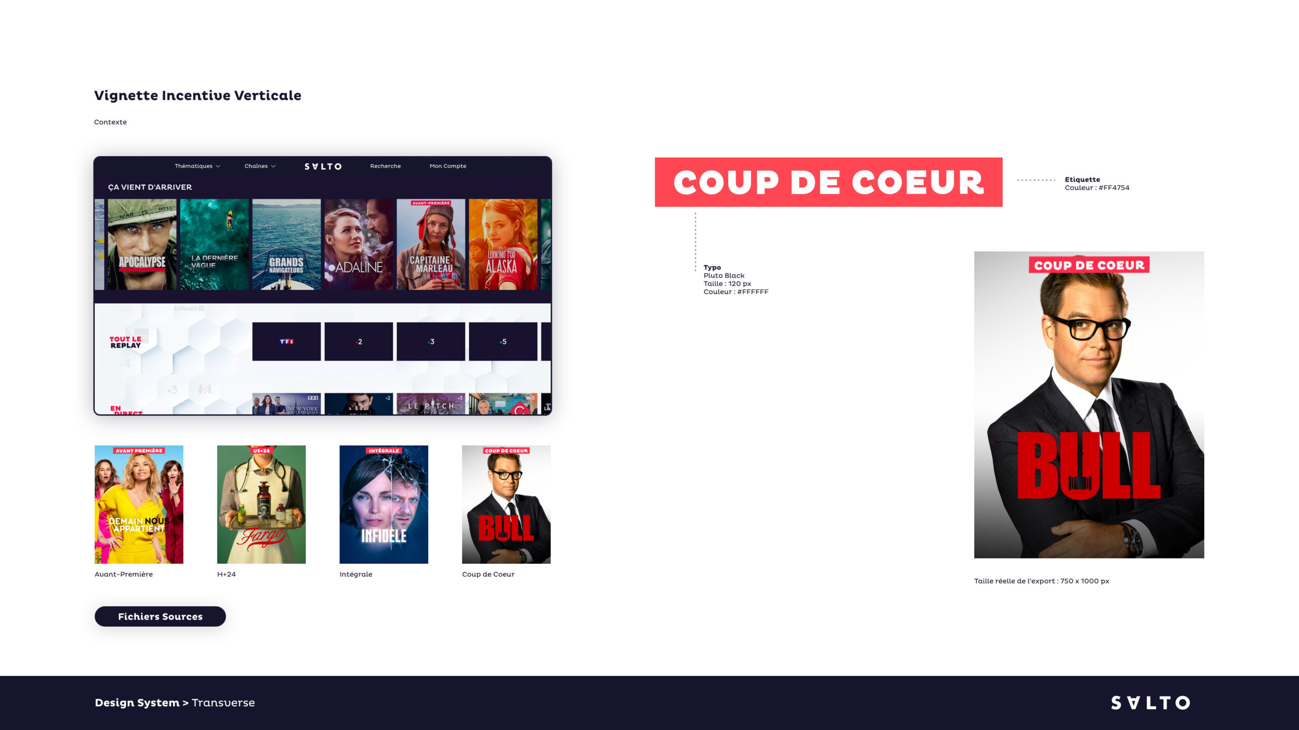
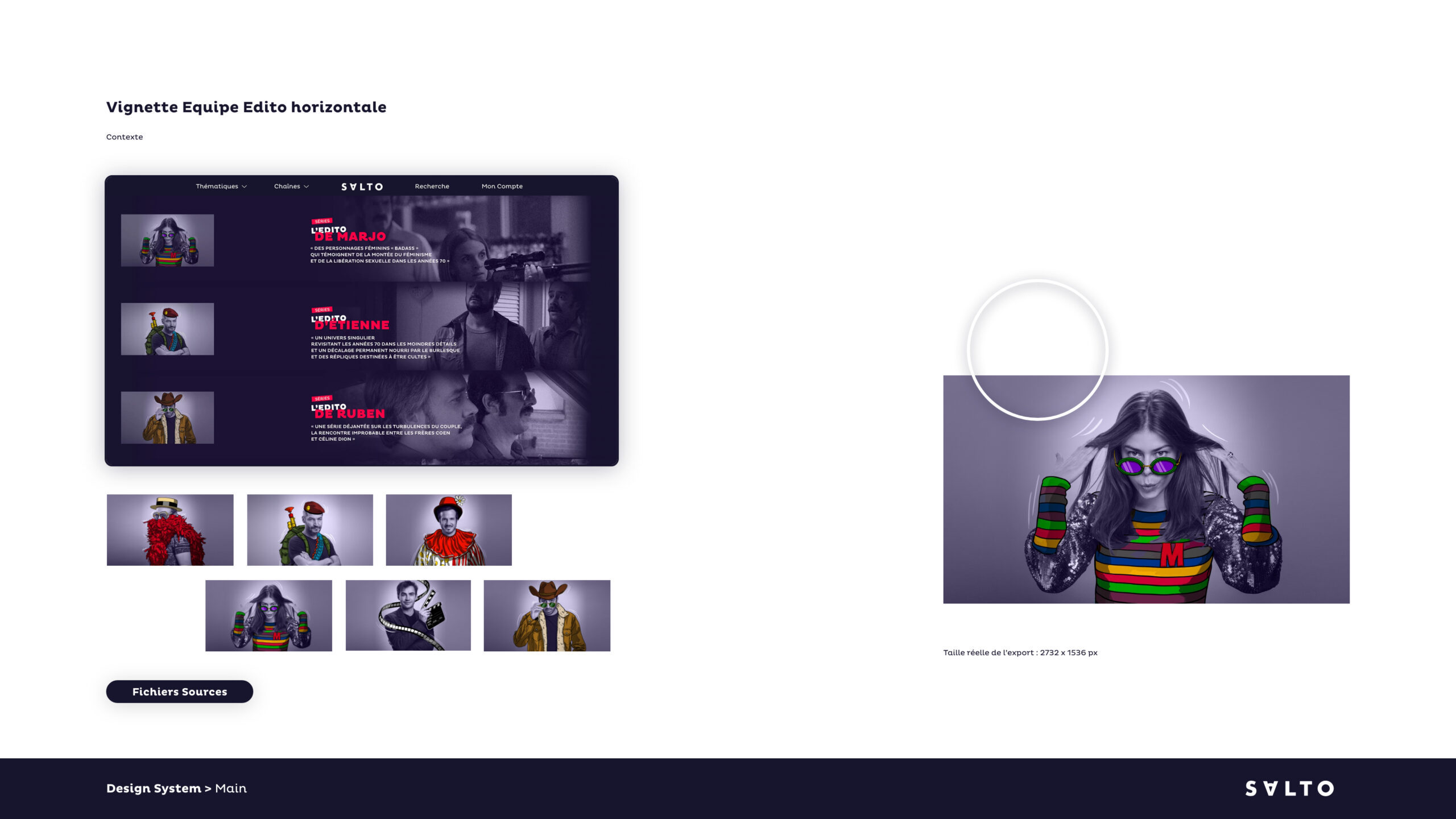
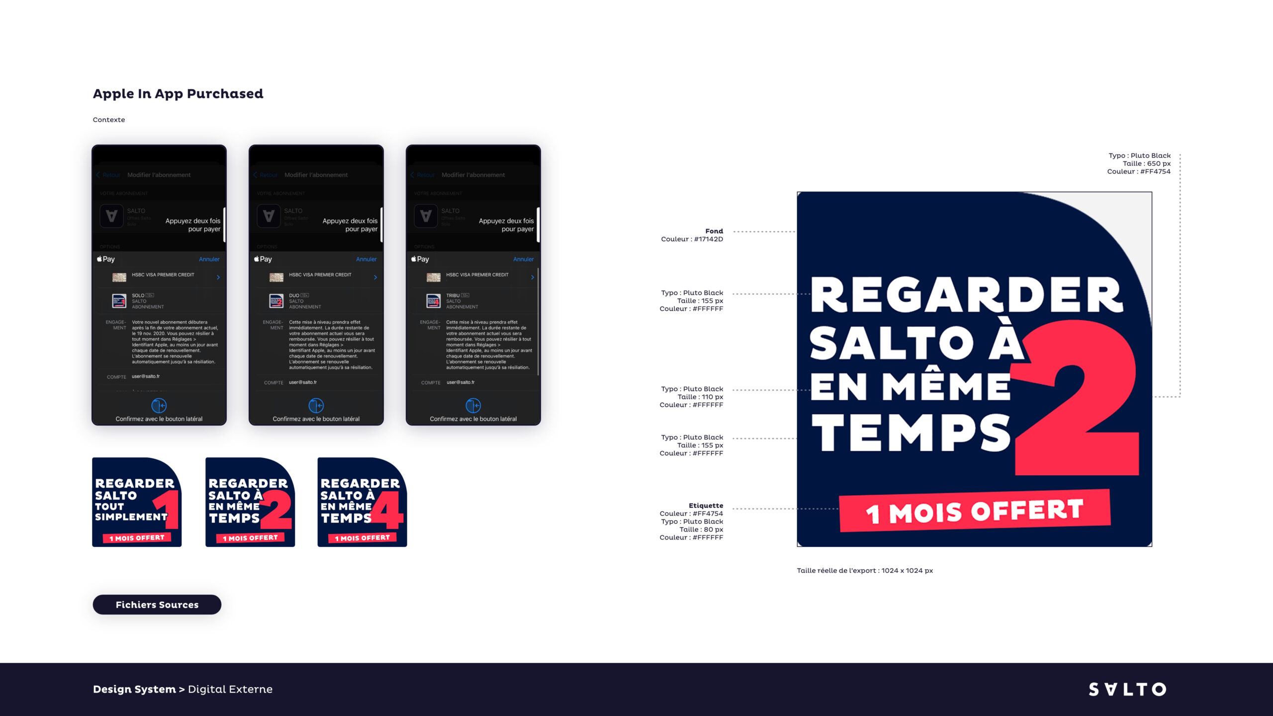
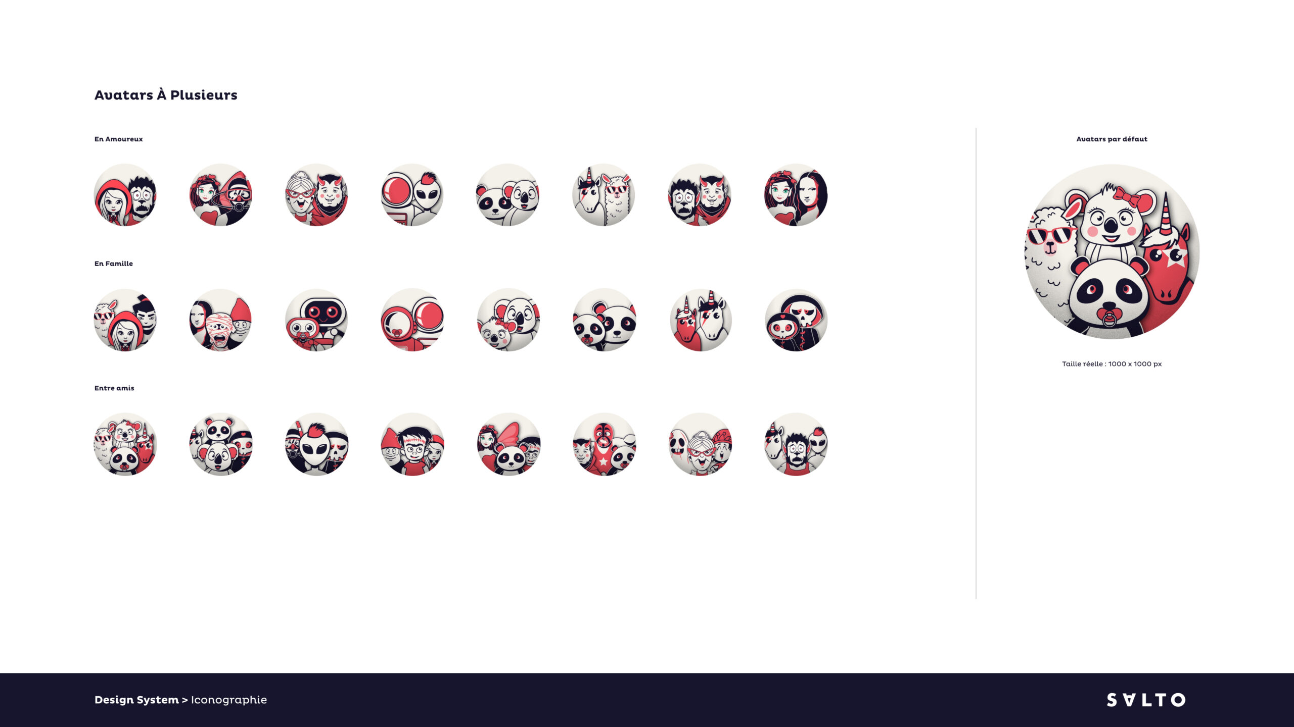
All content required various creative formats
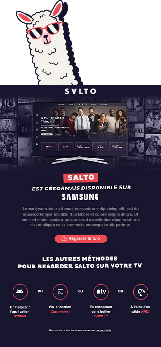
Salto’s ecosystem demands many visual formats because of different device demands, e.g., desktop, mobile, tablets, emails. Each took time and effort to maintain the best quality throughout the system.
MORE THAN
12 000
FILES CREATED
(IN TWO YEARS)
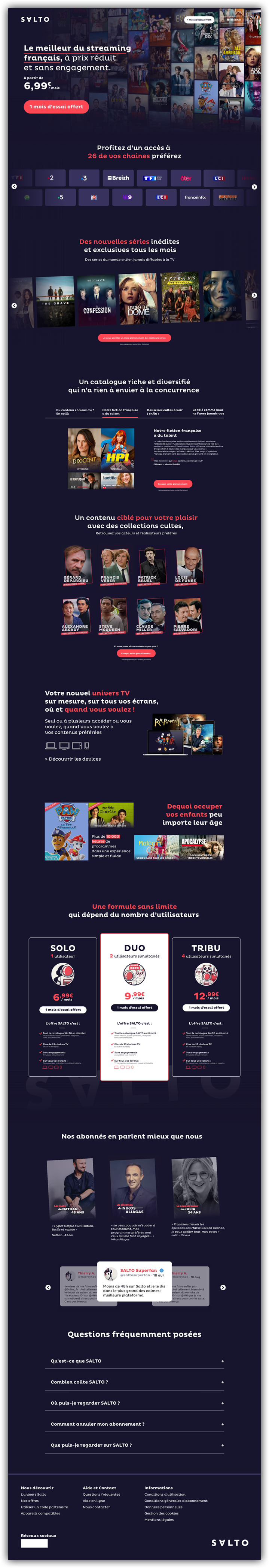
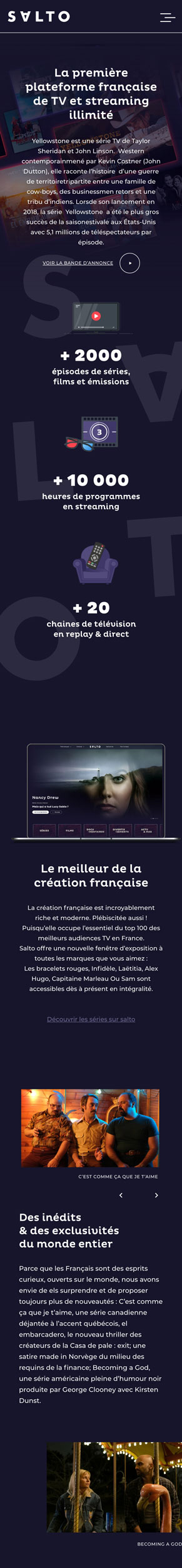
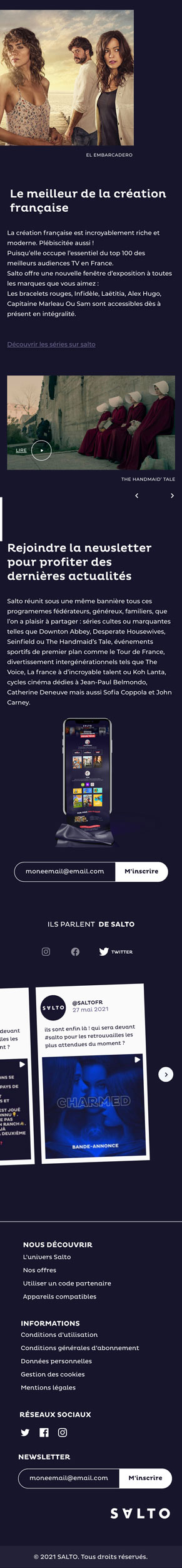
Landing page research to help increase subscription rates
We worked on countless page designs to help customers clearly understand Salto’s offer, leading to higher subscription conversion rates.
Started with a clear message that shows Salto’s strengths compared to other streaming platforms while displaying its catalogue diversity from films to series to kids’ TV.
2.
Used auto-animated lines to briefly and accurately show the channel’s offerings.
3.
We worked on lucid visual presentations different to the usual forms to spark an interest and focus on content.
4.
Every single user block needed to be tested, hence our desire for data on usability. User behaviour is defined by the rule that they often don’t interact much with webpages, carousels, and in-depth information. We had to show them the catalogue depth and relevant information without bombarding them or creating an overly lengthy page.
5.
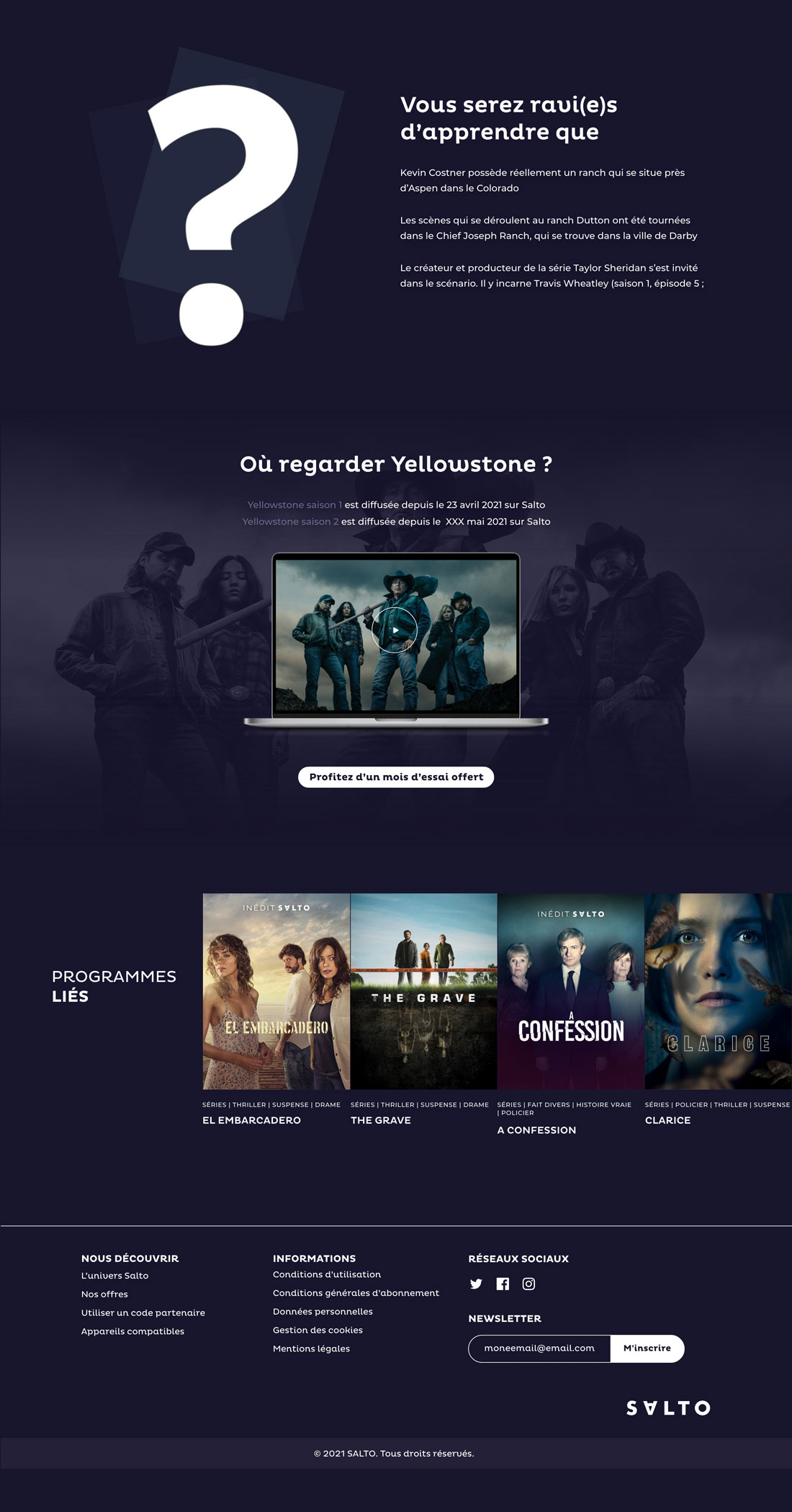
Highlighted one of Salto’s most potent assets — the content. One of a user’s most well-known struggles is looking for something to watch. Salto needed to know its platform was easier to use than the competition, thanks to its precise algorithm and knowledgeable editorial team.
6.
We opted for a human-centric approach, something we knew would catch the attention of parents. « Find something to occupy your children, whatever their age». This is a dream parental touchpoint: free time for adults while the kids are occupied and not jostling for attention.
7.
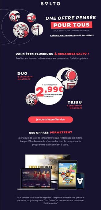
Frequently pushing the «no limit» subscription policy where the only variant is how many people can watch simultaneously. We also wanted to highlight Salto’s «duo»subscription option.
8.
We used the «star» to talk about products and why people love and use them. We also captured the power of testimonials, citing tweets as «real stories».
9.
We ended the page with an FAQ section to help the customer’s journey and reduce the volume of customer questions by email or phone to Salto.
DESIGN
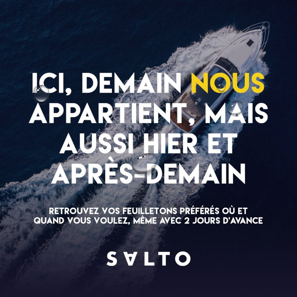
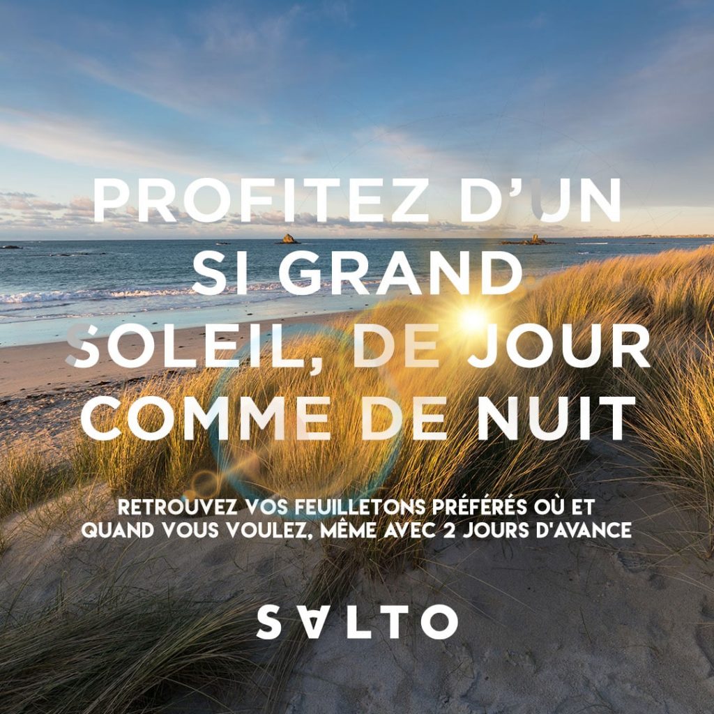
mail campaigns
that strike a chord
We wanted content designed to ignite curiosity about Salto and its products and encourage people to continue browsing. Around 20 different email templates were designed so that Salto staff could produce mail campaigns autonomously.
that touch people by the content and the design that create curiosity and call to scroll to see more.Around 20 different email have been designed s a template
SOCIAL
media that give vibes
Communicating emotions through a square is not as simple as it seems.
A DESIGN
SYSTEM
TO RULE THEM ALL
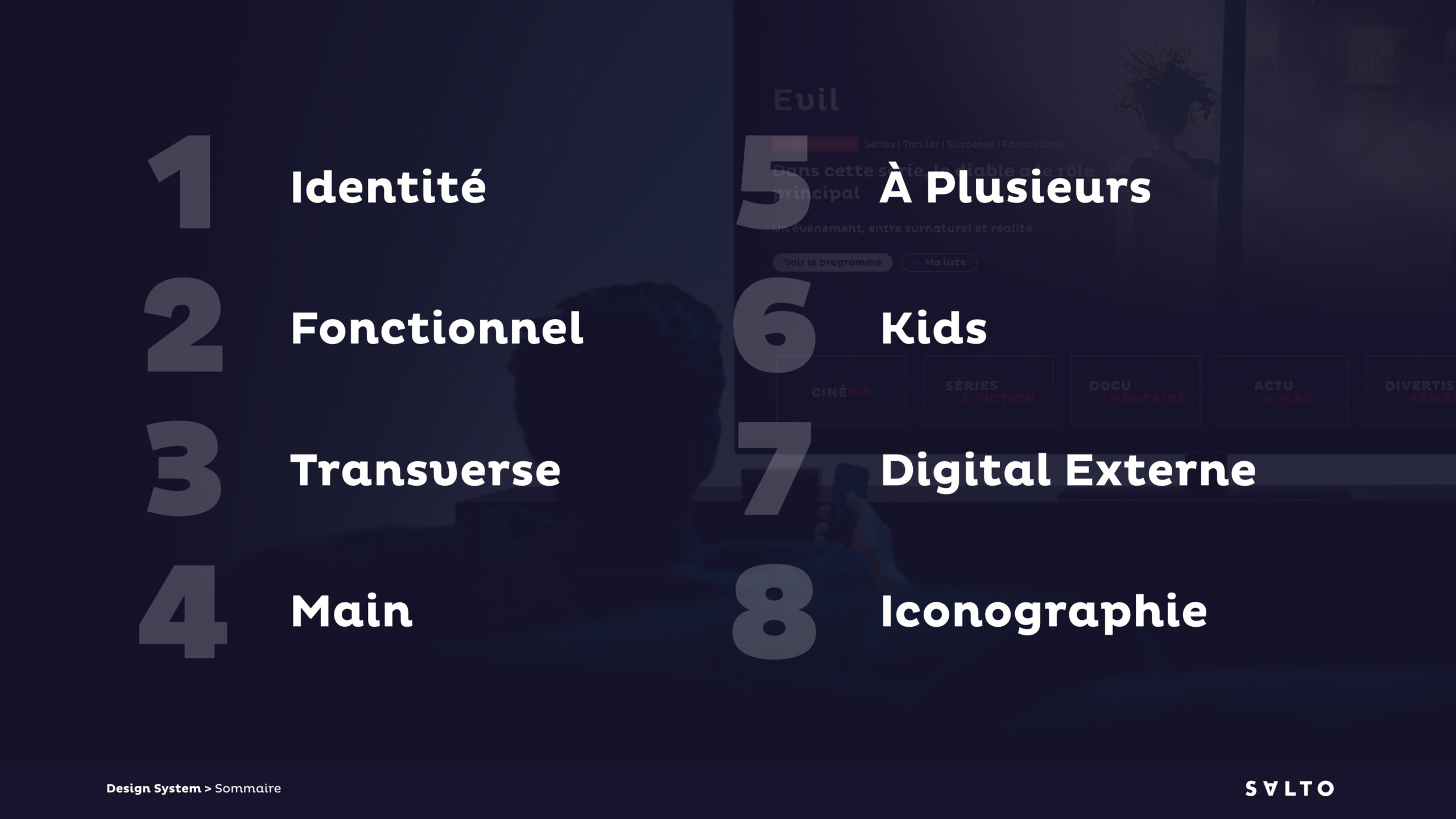
Lots of companies don’t invest in these, but they are a must-have. We wrote 78 pages of guidelines for Salto explaining how its platform works.
A
PLATEFORM
THAT ENGAGES
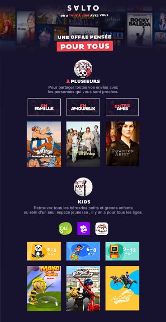
by helping people to discover content variety.
A second platform allowed Salto to give a clearer view of its ecosystem and products to customers. It’s also a great SEO tool.
Templates allowed Salto to recreate and edit pages at will in a simple, user-friendly manner to match their desired requirements.
Templates allowed Salto to recreate and edit pages at will in a simple, user-friendly manner to match their desired requirements.
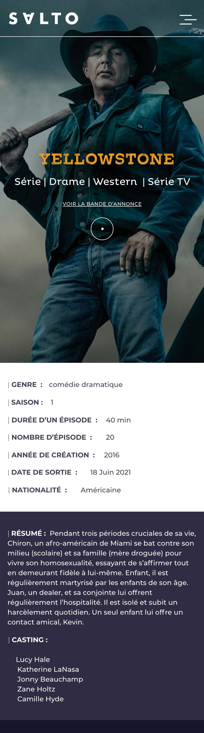
Specific pages that required a UX-centred approach
Design doesn’t always mean things that need to be beautiful. Design is often a response to a problem. With Salto, it was about delivering a solution that fitted the user’s need in the simplest way possible.
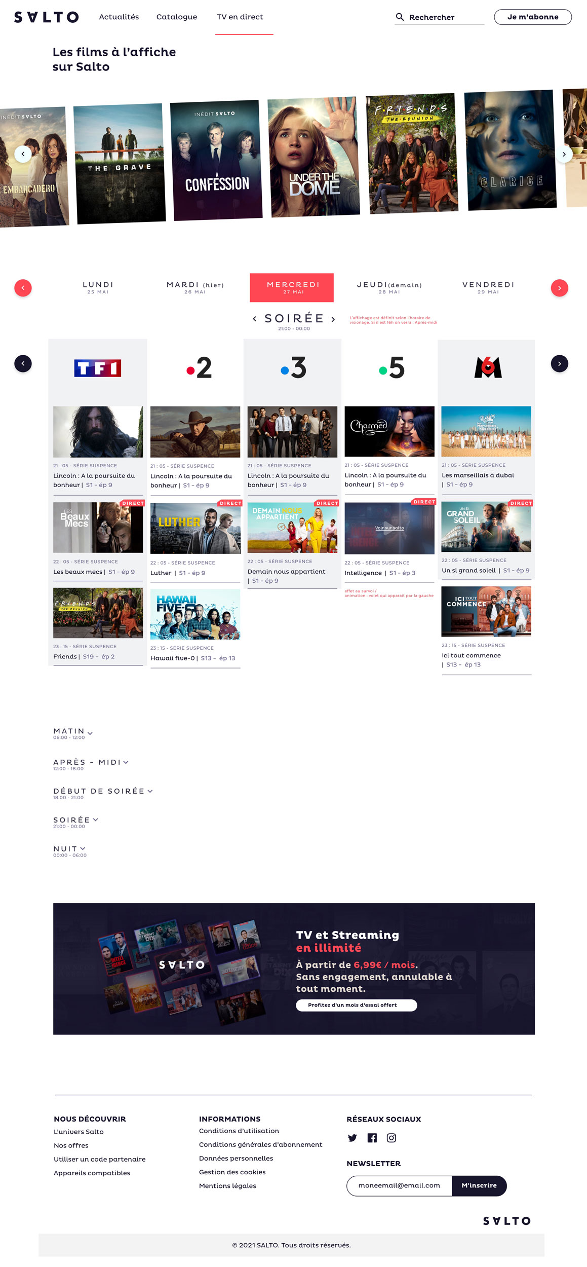
The most significant challenges were making the search page and program page smooth for users to operate.