A new way to be fashionable whilst taking care of the environment.

A new way to be fashionable whilst taking care of the environment.

Mode éco-responsable

Social media

Style, quality and transparency of ecologically-responsible fashion.

The brief

  • Helping Noda with its digital communications.
  • Creating a visual identity for social networks for a brand whose principal value is defending the environment and achieving responsible consumption. 
  • Using fashion as a means of expression. 

The analysis

The fashion industry has undergone a profound transformation in recent years. Digital media and social networks have played their part in accelerating and changing the traditional fashion calendar, helping to satisfy increasingly trend-hungry customers who demand availability immediately.

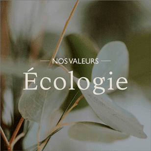
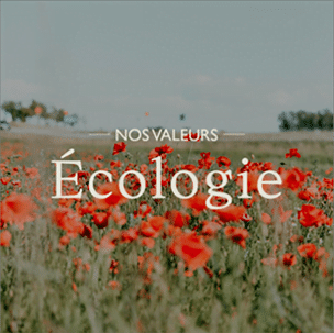
At NODA, we heard Mother Earth’s cry for help, uniting fashion and ecology and making space for positive action against climate change and fast fashion.

The Patagonia brand is a clear example of responsible activism in fashion. They’ve made it their business to save the planet, supporting youth activists against drilling for oil, taking action on the most pressing environmental issues facing our world, and transforming how they make their products.

When activism, fashion and design
come together

When activism, fashion and design come together

Images and words coexist harmoniously and peacefully, allowing people to connect with the world through design. This combination is one of graphic design’s most effective disciplines for presenting specific content to a target audience. The fusion of photographs and illustrations with the gravitas of words create a perfect format for the in-depth development of any subject matter.

Fonts & Colors

Fonts in use

We use two types of typography for our creations.

We use Ortica (it would be nice to put the word Ortica in the Ortica font, I don’t have it on Word) for titles and Gill Sans for the copy.

Ortica

Ortica is a calligraphic serif font designed by Collectivo with two contrasting but matching personalities. We chose Ortica Light for a smoother reading experience.

abcdefghijklm
nopqrstuvwxyz

1234567890
!?$’`´%&()=

Gill sans

Gill Sans is a widely-used sans serif typeface created by the typographer Eric Gill.
abcdefghijklm
nopqrstuvwxyz

1234567890
!?$’`´%&()=

Color palette

Colour is a powerful element in our lives, affecting our moods and how we react to situations, including fashion. We chose a neutral lime green colour palette with a twist to make the copy stand out.

Simplicity is design’s best friend.

editorial design as a rule —

well, no set rule shows how to seduce an audience. 

A cover, typography or image carry significant weight when people decide what to read or watch.

Editorial design is the perfect combination of elegance and simplicity, generating an attraction and connection between image, text and people to arouse curiosity and interest.

There is no set rule that indicates the way to seduce the audience.

What is clear is that the cover, the typography or the type of image… have an important weight when it comes to inviting people to read or see.
Editorial design is the perfect combination of elegance and simplicity.

Generating attraction and connection between image, text and people to arouse interest.

The power of communication
lies in images.

What attracts you to a publication is what you see first: the cover. 

Some 90% of human beings have a dominant visual memory. Through editorial design, we get potential readers to become buyers. 

Brand values need to seep through the images, generating a visual impact and memory with a simple design that captures people’s attention.

Connecting with our consumers through words & design.

Connecting with
words through
design.

photography  Citation / quote

We show brand values using simple images and avoiding the classic “model” vision of a fashion brand.

we show the brand values in a way that is more image- and message-dominant

We believe that beauty is also on the inside

Using white space as a communication vector

A publication’s interior must invite people to read it. The editorial structure combines images with texts while playing with each element’s position to keep the reader interested and avoid design monotony.

A publication’s interior must invite people to read it. The editorial structure combines images with texts while playing with each element’s position to keep the reader interested and avoid design monotony.

Publications bring value
to consumers.

We tell you
the ideas in detail

It was essential to form each slide in a way that was clear for our followers. We divided the information into sections to people them understand it clearly.

To add value, it is necessary to divide the information into several slides, as all the ideas in the same slide will make the user abandon the post.

Much more
than consumers

We established three formats using the developed editorial design to highlight NODA’s partner brands. We highlighted the text with sour colours to give a sense of elegance that represent NODA’s lines and values.

Editorial design is something that cannot be taken lightly. There is a concept and an idea to respect.

That’s why we work very carefully on each project to create coherent content that responds to the values, purposes and objectives of the brand.

#NoDamageStillTrendy