Logo Hommage Logo Hommage Logo Hommage  TO 

Taking responsible property investment to the next level with sustainable development

WEB DESIGN — VISUAL IDENTITY

Taking responsible property investment to the next level with sustainable development

WEB DESIGNVISUAL IDENTITY

First things first

What was our main goal for this project?

WHAT IS ETHIKET?

Ethiket aims to reduce the ecological footprint and social impact of real estate through developing skills and awareness within the industry. We will integrate planning, systems, and day-to-day activities into their vision for a greener real estate industry.

THE MISSION

Our first goal was to use light-hearted, environment-focused design with a human touch to ignite the public’s imagination.

WHAT WE DO

We devised a human-focused real estate agency whose concepts would resonate with the public.

Keep it real

Why the human factor is so
important in design

We knew Ethiket’s brand needed to present complex concepts in an accessible and empathetic way from the moment we started work. Our target audience needed to understand our messaging to increase engagement and the feel-good factor.

Our colour palette and artistic design conveyed a non- threatening visual tone, allowing users to browse peacefully and not be overwhelmed by the content.

Looking at the web from afar allowed
better understanding up close
Looking at the web from afar
to understand it up close

Let’s look at the sitemap

Visual style guide

Stripping the website’s identity

Colour is essential to good interface design. Our carefully-considered colour choices impact how potential customers and users see the brand. That is why we kept the brand’s three principal colours and added six more to complement and enhance texts and illustrations.

Because of their dynamic relationship, we used Obviously and Montserrat typefaces. The Obviously font is strong and will make consumers pay attention; Montserrat is a softer typeface, soothing on the eyes in the main body text.

Primary Colors

Secondary Colors

Backgrounds

Typograhy

Obviously

Montserrat

Wait! There’s more to add!

Bringing value with images,
icons and illustration

01

Using leaves to represent an
ecological project

Custom illustration affords a unique opportunity for brand definition. We used leaf illustrations to enhance Ethiket’s ecological stance towards Socially Responsible Investment (SRI).

02

Illustrations give meaning

Small, customized icons or illustrations accompanied texts and bullet points to reinforce prescient concepts and meanings within explanations.

03

Real estate pyramid

Ethiket wanted information categorised and presented in a pyramid fashion. Our solution was a scrolling screen that unveiled highlighted concepts in the desired pyramid construction.

04

Photography as a means
of expression

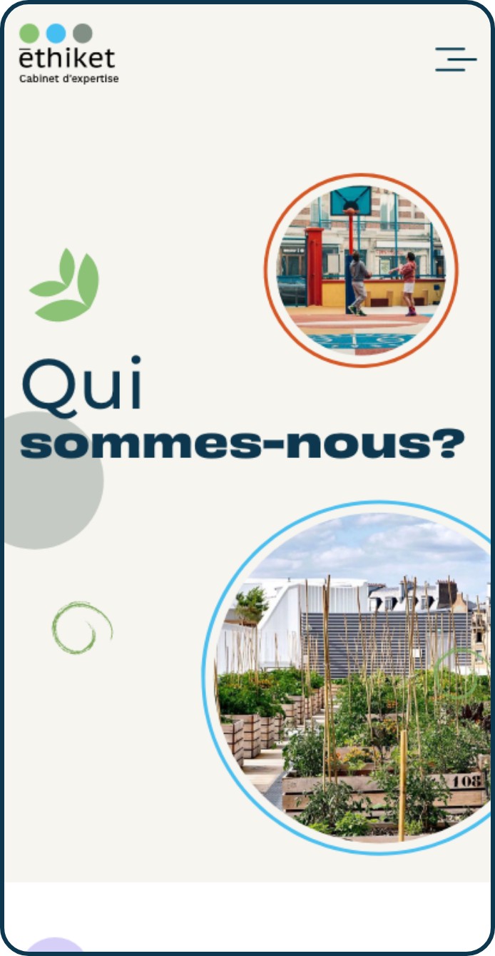
Images are potent weapons in the digital environment. That’s why we infused personality into the website by using images that fit perfectly with Ethiket’s ecological style. Inspirational images improved the user experience, helping them relax after reading large chunks of text and adding a sprinkling of professionalism to the website’s appearance.

Unique and consistent style
Creating an easy interface is an
investment for the future

A human-centred design and style increased user connection and website functionality. A simple design full of colour, images, and illustrations provided a common thread that linked every webpage.

The intuitive website now guides people on a unique educational journey through clear and understandable information.

Our Offers page

Nos Offre page

Actuality page

Actualité page

Contact page

Nous Contacter

olive-1.png

Real estate and ecology go hand in hand, if you know where to look.